The smartwatch market isn’t looking particularly hot right now. Pebble, a company that made a few exciting products, has been acquired by Fitbit and companies such as Motorola have delayed the launch of new models citing low demand. That leaves Samsung and Apple as the two big competitors in this segment, and the companies are taking different approaches to the same product.
The Apple Watch Series 2 focused on fitness, while the Samsung Gear S3 feels more like a general-purpose smartwatch. Samsung does address the fitness market with its Gear Fit 2, and while it is a great wearable, it isn’t a smartwatch. If you want a device that lets you quickly reply to notifications, you should look at the Samsung Gear S3 instead of the Fit 2. Let’s take a closer look at what it offers.
Samsung Gear S3 design and comfort
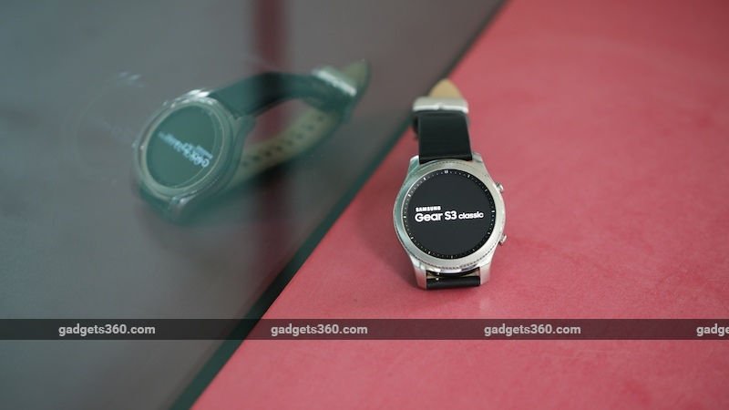
Surprisingly, the Samsung Gear S3 is quite bulky. Its predecessor, the Gear S2, was sleek and felt like a normal watch, but the Gear S3’s size means that we never really forgot that we were wearing the smartwatch. When we wore a jacket, it was hard to pull the sleeve back to get a look at the watch, and it even got caught on our backpack strap sometimes.
We really like the circular display on the Samsung Gear S3, and we think it looks better than the rectangular screen on the Apple Watch. However, we found the Apple Watch far more comfortable to wear, and that matters more. The Gear S3 will be too bulky for many people. It’s available only in one size so you might be forced to consider other products.

The Samsung Gear S3 retains the rotating bezel of its predecessor. You can twist it to scroll through a list of apps, read more text, or even to answer or reject a call. This definitely feels more intuitive than using a touchscreen on a smartwatch. Each small click on the bezel indicates that you’ve moved to the next widget or app.
However, we were unhappy with the Gear S3’s vibration mechanism. The Gear S3 uses vibration feedback to tell you when you get to the end of a list, for example, but it feels like two pieces of metal scratching each other. The vibration alerts for calls and messages are similarly annoying. If you’ve ever used an Apple Watch, you’ll probably never get used to the Gear S3’s mechanism. The Apple Watch produces subtle nudges for texts, and even the alert for calls feels like someone quietly tapping your wrist. That’s just not the case with the Gear S3.
The Samsung Gear S3 has two buttons – one serves as a home and back button, while the other is for selecting apps. The bezel and buttons are all metal. The base of the smartwatch is made of plastic and the strap is leather. All of these have been designed very well and lend the watch a premium feel.
The Gear S3 has GPS and Wi-Fi support, but the leather strap and its bulk made it uncomfortable to use when working out. It automatically counts your steps and detects exercise, which is a good thing, but we didn’t enjoy wearing it while running. The combination of a leather strap and a metal buckle was uncomfortable during a long run, so we just took it off midway. This smartwatch feels more suited for everyday use than for serious fitness enthusiasts. Despite its size, the Samsung Gear S3 wouldn’t look out of place with formal attire, making it a good wearable at the office and in meetings.
Samsung Gear S3 performance
We found the Gear S3’s step tracking to be reasonably accurate over the course of a week when we walked roughly 7,000 steps per day. We noted a deviation of around 10 percent against the step tracker on an iPhone 7, primarily because we didn’t always have the phone in our pocket when walking around the office or running quick errands. The Samsung Gear S3 runs Tizen, which means that it does not have the wide range of apps available for watchOS and Android Wear. Most of the “apps” at the top of the popularity chart are watchfaces. The watch can pair with both Android and iOS phones, but on Apple’s platform, the Gear S3 offers limited functionality. This isn’t Samsung’s fault since there are limitations in iOS that only the Apple Watch can get around. For example, you can’t reply to texts or do anything but dismiss most notifications when paired with an iPhone. You can answer calls via the Gear S3 and that works flawlessly.
You get the full range of features on Android, and we found that the watch made using our phone usage a lot more convenient. We didn’t need to take the phone out of a pocket or go to where it was lying in order to reply to a message on Facebook or WhatsApp.
Tizen runs smoothly on the Gear S3, but Samsung is yet to nail the companion app experience. When we attempted to download apps or watchfaces, the Gear S app on both platforms switched to Hindi. We couldn’t find a way to change it back to English or to any other language. If you can’t read Devanagari script, then you’re going to find this very hard to use.
Battery life on the Gear S3 is quite impressive. We managed to use it for well over two days on a single charge. The charging dock is also elegant, if a little bulky, and makes it very easy to charge the watch by just propping it up.

Verdict
Overall, the Gear S3 is a pretty impressive smartwatch, but it’s mainly for Android users, and iOS compatibility should be seen as just a bonus. We hope that Samsung makes its next model slimmer. We also hope that more apps are added to the Tizen ecosystem, but that will only happen if the Gear S3 sells well. Samsung needs to identify its target audience and market this watch well, because a lot of people seem to have decided that they don’t need a smartwatch at all.
Priced at Rs. 28,500 and featuring water and dust resistance, the Gear S3 is an interesting product. There aren’t many current-generation alternatives for Android users. However, on the iOS side, the Apple Watch Series 1 costs less and does most things better thanks to its tight integration with the ecosystem. If you’re an iPhone user and need your watch to be swim-proof, the Apple Watch Series 2 costs only Rs. 4,000 more than the Gear S3.
Pros
- Good battery life
- Easy to control with the rotating bezel
- Smooth OS
Cons
- Companion app could be better
- Dry app ecosystem
- Bulky
Ratings (out of 5)
- Design: 3.5
- Performance: 3.5
- Value for money: 3
- Overall: 3.5
[Source:- Gadgets360]


