
A few days after the rollout of the redesigned Google+ interface for Web and mobile, Google Product Director Luke Wroblewski has revealed a bunch of updates he and his team are working for the Web interface. Although the update has started rolling out for the Web client, it would soon be rolling out to Android, iOS, and the Web as well.
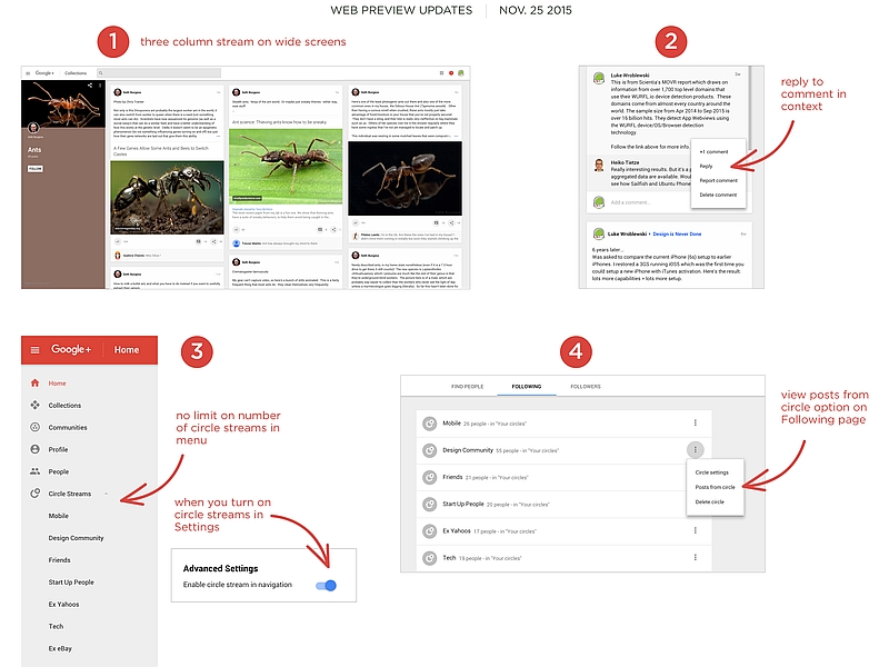
In a Google+ post from Thursday, Wroblewski said the update brings a three-column stream view for very wide screens and adds the ability to reply to comments in context. The update also removes the limit on circle streams in the menu and introduces the option to view Posts from Circle from the Following screen. These changes come as a result of user feedback.
The search giant last week revamped Google+ online social network focusing on people’s interests, and tuned for smartphones or tablets.
It also revamped the service on Android with version v6.8. The version includes the redesigned user interface and comes with some new features. The new Google+ interface for Android sports a new tab bar that pops up at the bottom of the feed. The tab has Home, Collections, Communities, and Notifications buttons. It’s a handy addition, as it makes it easier to navigate around the network, and check notifications. The settings are also arranged in a different order, and there’s a G+ activity log, too. If you don’t see the updated app available for you on the Google Play, and are impatient to try it, you can install the Google-signed apk of the new version.
[“source-gadgets.ndtv”]